Health | Pandemics
Coronavirus Pandemic (Covid-19)
Health | Pandemics
Coronavirus Pandemic (Covid-19)
| Don's Home
Health | Pandemics
Coronavirus Pandemic (Covid-19)
| Contact |
| Other Pages: Corona Facts | Case Fatality Rate (CFR) | Treatment-Vaccine | Coronavirus Safety - Prevention - Treatment | Personal Protection Equipment | Terms Glossary | Vaccines | Vaccination | Forcasting |

The european surge of BA.2.75 seems to have peaked.
 August 5 - Despite all the news about a BA.5 surge most regions are now seing decreases in the new case rate. In the last 2 weeks the US new case rate dropped 20% and Europe dropped 30%. However case rates in the US are still 3 times what they were on Apr 1 and Europe is double what it was on June 1, still well below peaks in January.
Dr Scott Gottlieb, former FDA commissioner, said on "Face the Nation",
"We are probably only picking up 1 in 7 or 8 infections, because people are using home tests which never get reported.
As of December 4th The Omicron variant had been detected in at least 38 countries but no deaths have yet been reported.
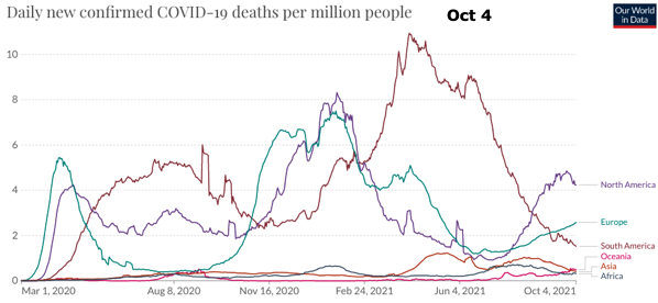
North America and Europe are still well off their highs of 450 and 350 cases per million per day.
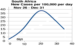
Africa's cases cases are concentrated in 6 countries, Tunisia, Nambia, South Africa, Botswana, Libia and Zambia, where the combined case rate is 350 per day per million.
Some charts here are only updated every several weeks,
but you can click on the chart to get the current version.
| Variants | Dates | Peak daily infection rate per 100,000/ Daily Deaths per 1M |
|||
|---|---|---|---|---|---|
| N. America | Europe | S. America | USA | ||
| Alpha | March 2020 - July 2021 | 47/8 | 39/7 | 33/11 | 76/11 |
| Delta | July 2021 - Nov. 2021 | 33/5 | 50/5 | 18/5 | 50/6 |
| Omicron * | December 2021 - | 150/5 | 207/4 | 89/4 | 241/8 |
| Cumulative to Sept 17, 2022 | |||||
| % Infected | 19.0% | 30.2% | 14.7% | 28.4% | |
| Deaths per Million | 2,526 | 2,585 | 3,058 | 3,126 | |
| Daily Death Rate per million Sept 15, 2022 | |||||
| Daily Deaths per Million | 0.88 | 0.75 | 0.25 | 1.27 | |
Number's are 7-day averages.
1,000 deaths per million is 0.1% of the population.
See Our World in Data for current rates.
The numbers are significantly undercounted. The latest WHO report in May 2022 says there have been around 15 million cumulative cases way more that the 6 million reported.
See Data Accuracy
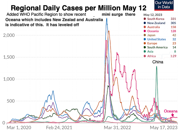
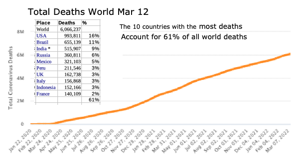
Asia and Africa account for 76% of the world population but only 23% of the deaths.
Oceana has one of the highest infection rates as of January 2022, because of an outbreak in Australia, but over the course of the virus they have the lowest total death rate, 148 per million, of any continent.
There are multiple sources of data giving information about the number of SARS-CoV-2 infections in the population, but all have major drawbacks, including biases and delayed reporting. For example, the number of confirmed cases largely underestimates the number of infections, and deaths lag infections substantially, while test positivity rates tend to greatly overestimate prevalence.
From Estimating SARS-CoV-2 infections from deaths, confirmed cases, tests, and random surveys Proceedings of the National Academy of Sciences July 2021
See Actual Deaths below.
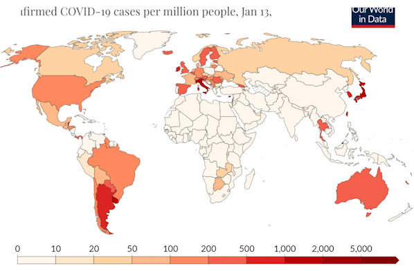
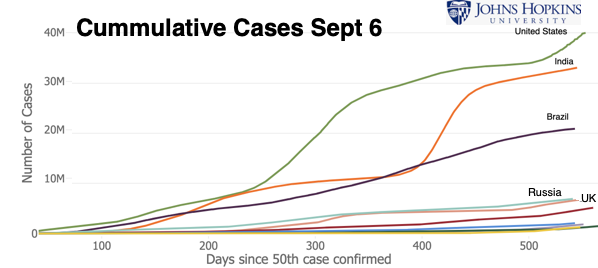
World
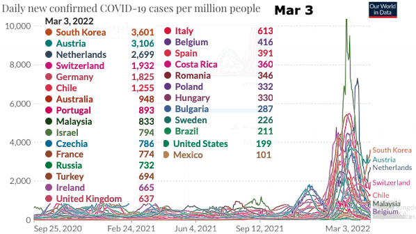
Regional Per Capita Rate of new infections:
Click on the charts to get the current version from the source.
- North America includes Central America, the Caribbean and Greenland.
- Oceania [½ of 1% of the world population] includes Australia (59% of the population), Melanesia (Papua New Guinea, Fiji, Solomon Islands, ...), Micronesia (Marshal Islands, ...), and Polynesia (New Zealand, Samoa, ... )
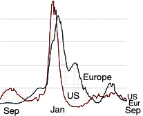
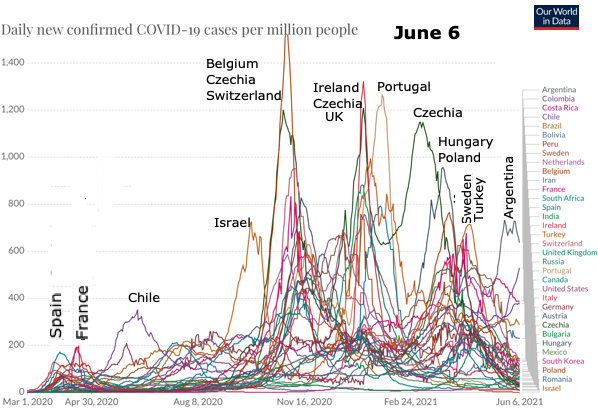
I started this chart as the Omicron surge was growing to show how countries were following a similar pattern.
I kept it because they were generally indicative of Europe and North America.
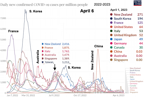
I added New Zealand and Taiwan because they were traditionally the lowest rates in the world and were having a surge in March and May after the world Omicron variant surge in January.
New Zealand, Japan, S Korea and Taiwan which had been doing much better with cumulative death rates of less than 600 per million while Europe and North America were 4 times higher around 2,500 deaths per million.
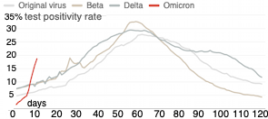
Omicron infects different cells in the upper respiratory tract rather than in the lungs, which makes it more transmissible but less severe than the previous variants.
My theory is that the western countries have gotten close the herd immunity (A CDC report )
which kept their new infection rates down.
In October Europe seemed to be starting another surge. The US had traditionally lagged them by a couple of weeks, so we'll have to see what happens.
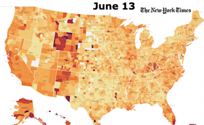
Click on the map below to go the source where you can click on individual countries for their rates.
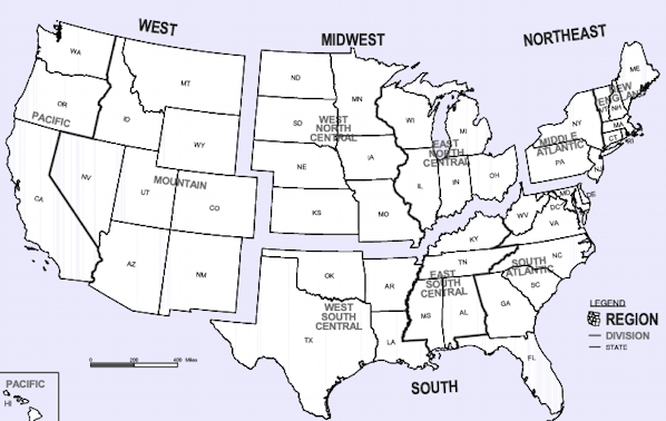
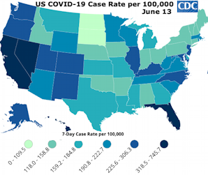
United States:
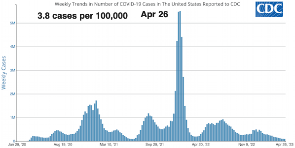
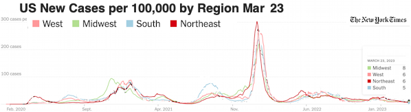
2022 New Cases per 100,000
| Jan 10 | < Mar 20 | Apr 7 | Apr 23 | May 9 | May 20 | Jun 2 | Jun 17 | July 1 | jul 18 | Aug 18 | Oct 1 | Oct 19 | Nov 9 |
|
| Northeast | 302 | 9 | 14 | 24 | 36 | 49 | 33 | 25 | 26 | 31 | 24 | 20 | 18 | 17 |
| Midwest | 185 | 6 | 6 | 13 | 23 | 30 | 26 | 24 | 25 | 29 | 28 | 14 | 12 | 15 |
| West | 215 | 11 | 9 | 12 | 19 | 32 | 36 | 40 | 43 | 45 | 25 | 12 | 10 | 10 |
| South | 203 | 9 | 7 | 9 | 13 | 22 | 26 | 31 | 37 | 42 | 33 | 12 | 8 | 9 |
Variants
New variants BQ.1, BQ.1.1 and BA.4.6 now account for 37% of new cases in the U.S. BA.5 is still the most prominent variant.
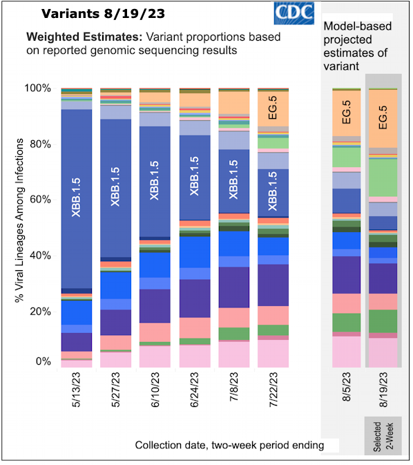
Source: Variant Proportions - Nowcast CDC
October 29
| BQ.1 | BQ.1.1 | BA.4.6 | Total | |
|---|---|---|---|---|
| US | 14.0% | 13.1% | 9.6% | 36.7% |
| NE | 13.6% | 6.4% | 10.2% | 30.2% |
| NY, NJ | 23.5% | 19.0% | 8.4% | 50.9% |
| Mid East | 10.2% | 16.6% | 11.4% | 38.2% |
| SE | 10.2% | 11.4% | 13.6% | 35.2% |
| midwest | 10.3% | 13.1% | 8.3% | 31.7% |
| South | 17.5% | 10.0% | 7.5% | 35.0% |
| SW | 12.6% | 12.0% | 4.3% | 28.9% |
See Variants in Corona Facts here
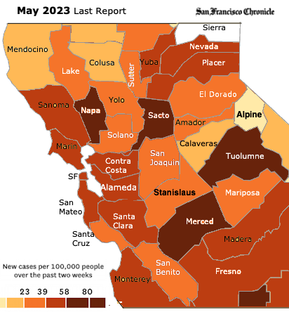
California
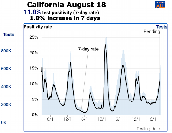
Summary
Some charts here are only updated every several weeks,
but you can click on the chart to get the current version.
Cumulative to Sept 24, 2022
| Deaths per 100,000 | Cases per 100,000 | Vaccinated | |||
|---|---|---|---|---|---|
| United States | 317 | 28,875 | 68% | ||
| California | 243 | 28,423 | 74% | ||
| Bay area | |||||
| Santa Clara › | 129 | 23,242 | 88% | ||
| Contra Costa › | 123 | 23,277 | 83% | ||
| Alameda › | 121 | 21,838 | 84% | ||
| Marin › | 120 | 19,360 | 91% | ||
| San Francisco › | 117 | 21,428 | 86% | ||
| Napa › | 116 | 24,330 | 80% | ||
| San Mateo › | 108 | 23,177 | 86% | ||
| Sonoma › | 105 | 22,578 | 80% | ||
| Solano › | 103 | 25,040 | 70% | ||
| Greater Sacramento | |||||
| Sutter › | 242 | 27,498 | 62% | ||
| Sacramento › | 222 | 24,371 | 69% | ||
| Placer › | 166 | 21,275 | 69% | ||
| Sierra › | 166 | 12,080 | — | ||
| Yolo › | 152 | 23,362 | 72% | ||
| El Dorado › | 120 | 18,875 | 64% | ||
North Central California Counties:
| 06/05 2021 | 07/15 | 08/14 | 9/3 | 11/1 | 1/7 | 2/1 | 2/25 | 3/12 | 4/2 | 5/6 | 5/27 | 8/18 | 9/29 | 10/21 | 11/11 | 12/10 | 1/13 2023 | 2/1 | 3/3 | ||
|---|---|---|---|---|---|---|---|---|---|---|---|---|---|---|---|---|---|---|---|---|---|
| United States | 4.2 | 9.3 | 39 | 50 | 20 | 195 | 126 | 22 | 10 | 7 | 21 | 33 | 29 | 14 | 11 | 12 | 20 | 18 | 13 | 10 | United States |
| California | 2.3 | 8.7 | 34 | 35 | 15 | 166 | 148 | 26 | 11 | 6 | 19 | 39 | 29 | 12 | 8 | 10 | 29 | 16 | 9 | 9 | California |
| Bay Area | Bay Area | ||||||||||||||||||||
| San Francisco | 22 | 7 | 167 | 87 | 32 | 8 | 14 | 42 | 59 | 22 | 10 | 8 | 16 | 27 | 14 | 8 | 12 | San Francisco | |||
| San Mateo | 1.3 | 6.4 | 21 | 23 | 8 | 174 | 109 | 23 | 13 | 11 | 37 | 61 | 23 | 10 | 10 | 14 | 28 | 14 | 7 | 9 | San Mateo |
| Santa Clara | 1.3 | 5.1 | 18 | 25 | 8 | 163 | 133 | 22 | 10 | 11 | 33 | 59 | 26 | 10 | 9 | 10 | 33 | 16 | 10 | 10 | Santa Clara |
| Alameda | 119 | 18 | 10 | 9 | 26 | 50 | 19 | 9 | 7 | 10 | 28 | 15 | 7 | 12 | Alameda | ||||||
| Contra-Costa | 25 | 50 | 27 | 9 | 10 | 9 | 28 | 16 | 7 | 15 | Contra-Costa | ||||||||||
| Napa | 1.4 | 5.1 | 25 | 26 | 8 | 149 | 117 | 28 | 19 | 6 | 23 | 37 | 24 | 9 | 10 | 2 | 19 | 14 | 10 | 9 | Napa |
| Marin | 31 | 60 | 18 | 7 | 7 | 2 | 19 | 11 | 8 | 9 | Marin | ||||||||||
| Sanoma | 182 | 139 | 26 | 17 | 8 | 29 | 46 | 19 | 9 | 9 | 6 | 17 | 13 | 6 | 8 | Sanoma | |||||
| Solano | 1.3 | 10 | 27 | 66 | 11 | 120 | 122 | 49 | 13 | 6 | 20 | 50 | 22 | 8 | 7 | 5 | 23 | 16 | 9 | 10 | Solano |
| Greater Sacramento | Greater Sacramento | ||||||||||||||||||||
| Yolo | 1.8 | 6.3 | 33 | 44 | 18 | 159 | 102 | 19 | 11 | 11 | 20 | 43 | 26 | 5 | 9 | 13 | 16 | 9 | 7 | 8 | Yolo |
| Sacramento | 0.3 | 11.7 | 39 | 73 | 14 | 117 | 121 | 25 | 10 | 7 | 15 | 38 | 24 | 9 | 10 | 10 | 21 | 11 | 9 | 10 | Sacramento |
| Placer | 1.3 | 8.3 | 37 | 77 | 24 | 91 | 109 | 24 | 8 | 4 | 12 | 34 | 19 | 7 | 7 | 8 | 19 | 11 | 7 | 8 | Placer |
| Sutter | 13.4 | 60 | 72 | 22 | 99 | 110 | 26 | 22 | 8 | 11 | 29 | 30 | 11 | 6 | 6 | 16 | 16 | 5 | 6 | Sutter | |
| El Dorado | 11 | 30 | 16 | 6 | 5 | 10 | 19 | 10 | 5 | 5 | El Dorado | ||||||||||
| Sierra | 0 | 16 | 3 | 0 | 5 | 14 | 10 | 0 | 5 | 13 | 0 | 5 | 0 | 0 | Sierra | ||||||
| Davis | 18 | 4 | 212† | 41 | 10 | 6 | 4 |
The Bay Area in California which has had the second lowest rate of California's 5 regions behind Northern California and in the Fall of 2022 it had the highest rate. See Bay Area vs other CA regions.
My theory is that as of August 2022 the Bay area has had the lowest death rate, less than half the other regions, so the population does not have a built up immunity from prior infections.
I don't know why the New York Times numbers are always higher than the CA Department of Public Health numbers (see Yolo and San Mateo below).
Counties where I and my family live:
Updated on Thursdays:
Yolo County no longer lists Davis Stats.
City Wastewater Data
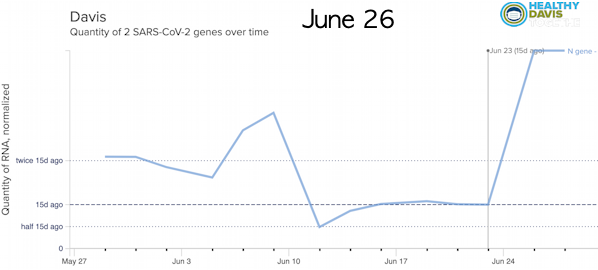
Healthy Davis Together Historic Wastewater Testing
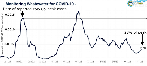
In January, Yolo County had 248 new cases per 100,000 reported and Davis had 212. Davis rates have traditionally been lower than Yolo County.
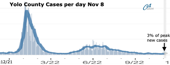
On Nov 7th Yolo County had 8 new cases reported per 100,000, 3% of the peak, but Davis wastewater counts were 23% of the peak.
So about 13% of cases are being reported.
The general explination for this is:
1. More asymptomatic cases which are not reported.
2. People doing self testing with mild symptoms which are not reported.
This along with an April, 2022 CDC report indicated that almost 60% of the U.S. population has been infected. means that as of June only about 10% of infections were being counted.
Although wastewater indicates a high level of infection at the end of August, Yolo county hospitalizations are 20% of what they were in January. California hospitalizations were 25% of January's.
Note: Wastewater results tend to be more variable than reported cases. See the national wastewater results above.
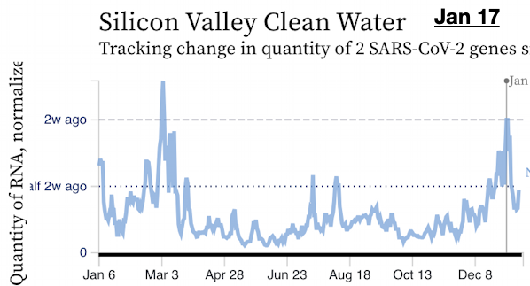
See Sewer Coronavirus Alert Network (SCAN) tracking - Stanford for other Bay Area wastewater results. More N. Central California data
Regional Cumulative Death Rates
These stats are not updated as frequently. Death rates are low compared to the first 2 years, so the the curve has flattened out.
1,000 deaths per million is 0.1% of the population.
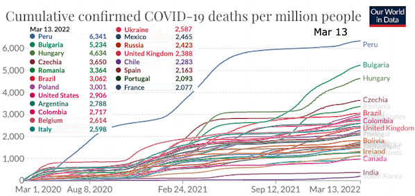
Cumulative Deaths per Million September 24, 2022 - Selected Countries
|
|
|
* Deaths are significantly undercounted. See Data Accuracy
Mexico and Russia were significantly undercounted in a May 2021 U. Washington Study below.
If you account for that, Russia would have 8,400 deaths per million, Mexico would have 4,700 deaths per million and India would have 3,600 deaths per million per a July 2021 Wall Street Journal report.
China could be up to 130
Deaths in other countries could be up to 40% higher.
Unvaccinated are 14 Times More Likely to Die From COVID | WebMD
|
|
Cumulative Deaths: 
California County Cumulative Deaths per 100,000 by Region - May 5, 2022
End of Executive Overview World Summary:
Regional Per Capita Rate of new infections:
Regional Cumulative Death Rates - Oceania [½ of 1% of the world population] includes Australia (59% of the population), Melanesia (Papua New Guinea, Fiji, Solomon Islands, ...), Micronesia (Marshal Islands, ...), and Polynesia (New Zealand, Samoa, ... ) All Countries: Total cases per day
Regional Stats and some countries of interest. Jan 14
* Central America, the Caribbean and Greenland are considered part of North America.
‡ Number of deaths are significantly undercounted.
    Estimated % counted
United States 63%
Mexico        35%
W. Europe     70-80%
Russia        18%
See estimated actual death counts at U. Washington Study below. Peru 6,002 Bulgaria 4,331 Hungary 3,868 Czechia 3,242 Romania 3,041 Brazil 2,874 ‡ If you adjust for the undercounting in Mexico and Russia their rates would be: Mexico 4,862 deaths per million Russia 8,358 deaths per million Regional Death Rates: S. America 2,732; N. America 1,999; Europe 1,968 Asia, Africa and Oceana all have less than 300 deaths per million. New Zealand, Australia, South Korea and Taiwan all had less than 100 deaths per million.
† A Wall Street Journal Report in July 2021 says that the actual death count in India is is between 3.4 and 4.7 million, 10 times higher than the 400,000 reported. Because Asia and Africa account for 76% of the world population but only 23% of the deaths we don’t compute a world rate. There are smaller countries in Asia and Africa who's infection and death rates are similar to other developed countries.
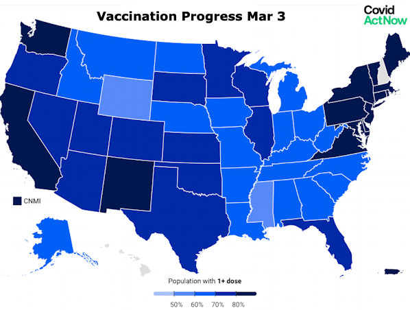
See World Countries Cumulative Cases and Deaths below Vaccination Rate: 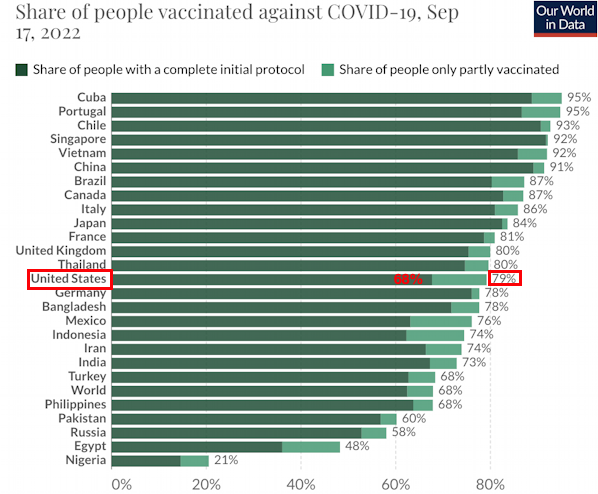
Data Accuracy
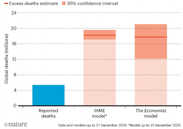
The most complete study to date was released by the World Health Organization (WHO) on May 5th 2022 Most of the excess deaths (84%) are concentrated in South-East Asia, Europe, and the Americas.
It shows that the full death toll associated directly or indirectly with the COVID-19 pandemic (described as “excess mortality”) between 1 January 2020 and 31 December 2021 was approximately 14.9 million, more than double the official death toll of 6 million. See more from the WHO. Previous Studies:
Almost 60% of U.S. Has Been Infected by COVID-19, CDC Says; Davis, CA Wastewater testing indicates that in June 2022 only 20% of cases were reported compared to January 2022. See "COVID’s true death toll: much higher than official records" | Nature March 10, 2022 compares data at the end of 2021 from The pandemic’s true death toll | The Economist Jan 31, 2022 and The University of Washington's Institute for Health Metrics and Evaluation (IHME)
The pandemic’s true death toll | The Economist May 2022
According to a May 2021 study by the University of Washington's Institute for Health Metrics and Evaluation (IHME),
Some examples Estimated % counted. See below.
Actual Total Deaths (estimated)
Note: There are several other smaller countries with higher total death rates.
A Wall Street Journal Report in July 2021 says that the actual death count in India is is between 3.4 and 4.7 million, 10 times higher than the 400,000 reported.
"Estimating excess mortality due to the COVID-19 Pandemic a study by Researchers at the University of Washington’s Institute of Health Metrics published in the Lancet March 10, 2022 . They found,
At Estimating global, regional, and national daily and cumulative infections with SARS-CoV-2 through Nov 14, 2021: a statistical analysis - The Lancet, Published in April 2022,
Dr Scott Gottlieb, former FDA commissioner, said on "Face the Nation", April 2022,
See Modern East Asian DNA hints at an ancient coronavirus outbreak | Science News United States:
January 23, 2022
See US Epicenters Pro-Trump counties now have three times the COVID death rates. Misinformation is to blame | NPR Dec. 2021 More United States Data California:
North Central California Counties
North Central Califronia Counties Map
The 10 counties who voted for Biden in 2020 averaged a total of 1,203 deaths per million over the course of the virus as of March 12, 2022 compared to the 2 counties who voted for Trump which average averaged 1,870 deaths per million (55% higher).
* Sierra County had only 12 new cases from Feb 15, 2021 to July 4, 2021 with a 7 day average of close to 0.
New Cases per day per 100,000
More California Data End of Summary Related Notes::Facts about covid-19 | Safety Prevention | What is the real number of infected people? | Sources | Good Twitter feeds World Stats:
Coronavirus Dashboard | ncov2019.live * New cases and deaths are 7-day moving-averages to adjust for the impact of administrative delays to reporting new data over weekends. Click on Charts to go to the current version. You can mouse over charts there to get more information. Numbers are significantly undercounted. See estimated actual counts above.
Note: We have limited our statistics to the 122 countries with more than 5 million population. There are smaller countries with higher per-capita rates.
% Vaccinated: Those who are vaccinated are about six times less likely to contract the virus and 14 times less likely to die from it.
COVID World Vaccination Tracker | NY Times
Deaths:
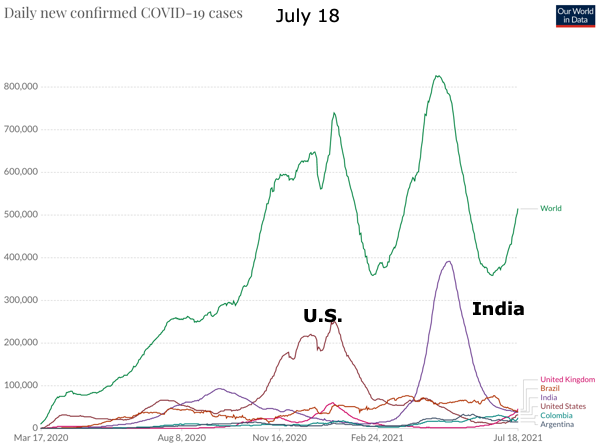
New Cases driven by largest countries.
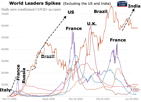
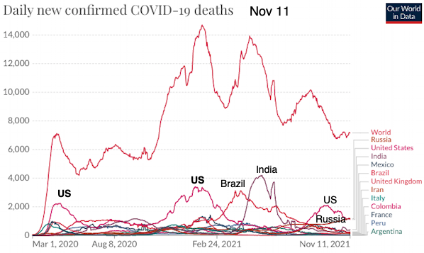
Spikes in Daily Cases:(Excluding the US and India)
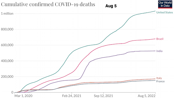
Cumulative Deaths World
Note: A report published by Arvind Subramanian, the Indian government’s former chief economic advisor, and two other researchers at the Center for Global Development and Harvard University said the actual number of deaths in India was likely between 3 million to 4.7 million between January 2020 and June 2021. This is 10 times higher than the 400,000 reported, so would put India at the top of the list of death rates.
World Total Deaths:
* A July 20th report suggests that India alone could actually have 4 million deaths instead of the 460,000 reported, increasing the world total to 8 Million. Most estimates for the 1918 Flu range from 17 -50 million with , with a couple of higher and lower estimates.
Actual Total Deaths (estimated)
-Countries with the highest numbers of actual (estimated) total COVID-19 deaths, March 2020 to May 2021
Note: There are several other smaller countries with higher total death rates.
23 Countries of Interest - Infection Rates See also COVID-19 pandemic by country and territory - Wikipedia
Countries with the highest peak infection rates out of
the 125 largest countries (population > 5 M),
Per Million:
Peak 7-day average new cases per Million
| |||||||||||||||||||||||||||||||||||||||||||||||||||||||||||||||||||||||||||||||||||||||||||||||||||||||||||||||||||||||||||||||||||||||||||||||||||||||||||||||||||||||||||||||||||||||||||||||||||||||||||||||||||||||||||||||||||||||||||||||||||||||||||||||||||||||||||||||||||||||||||||||||||||||||||||||||||||||||||||||||||||||||||||||||||||||||||||||||||||||||||||||||||||||||||||||||||||||||||||||||||||||||||||||||||||||||||||||||||||||||||||||||||||||||||||||||||||||||||||||||||||||||||||||||||||||||||||||||||||||||||||||||||||||||||||||||||||||||||||||||||||||||||||||||||||||||||||||||||||||||||||||||||||||||||||||||||||||||||||||||||||||||||||||||||||||||||||||||||||||||||||||||||||||||||||||||||||||||||||||||||||||||||||||||||||||||||||||||||||||||||||||||||||||||||||||||||||||||||||||||||||||||||||||||||||||||||||||||||||||||||||||||||||||||||||||||||||||||||||||||||||||||||||||||||||||||||||||||||||||||||||||||||||||||||||||||||||||||||||||||||||||||||||||||||||||||||||||||||||
Total:
Note: There are small countries (< 5 Million population) with more cases and deaths per million.
See Worldmeter and click on headings to sort.
Reported deaths (below) range from 34% to 70% of actual deaths according to the U. of Washington. See above. Worldwide they are double of what is reported.
According to a May 2021 study by the University of Washington's Institute for Health Metrics and Evaluation (IHME), reported deaths is significantly lower than actual deaths.
Around the World they are double what is reported.
The IHME report only included some of the countries with large numbers.
Actual (estimated) total COVID-19 deaths, xgxg020 to May 2021
| Country | Estimated Actual Total | Reported Total | Reported % of Actual | Deaths per M |
|---|---|---|---|---|
| Bulgaria | 38,640 | 16,905 | 44% | 5,600 |
| Mexico | 617,127 | 217,694 | 35% | 4,746 |
| Peru | 147,765 | 62,739 | 42% | 4,547 |
| Russian Federation | 593,610 | 109,334 | 18% | 4,066 |
| Hungary | 38,787 | 28,919 | 75% | 3,970 |
| Poland | 149,855 | 68,237 | 46% | 3,963 |
| Czechia | 41,446 | 29,574 | 71% | 3,910 |
| Ukraine | 138,507 | 46,737 | 34% | 3,184 |
| United Kingdom | 209,661 | 150,519 | 72% | 3,075 |
| Italy | 175,832 | 121,257 | 69% | 2,912 |
| Brazil | 595,903 | 408,680 | 69% | 2,787 |
| United States of America | 905,289 | 574,043 | 63% | 2,722 |
| South Africa | 160,452 | 54,390 | 34% | 2,676 |
| Spain | 123,786 | 85,365 | 69% | 2,647 |
| Iran | 174,177 | 72,906 | 42% | 2,051 |
| France | 132,680 | 105,506 | 80% | 2,029 |
| Egypt | 170,041 | 13,529 | 8% | 1,635 |
| Germany | 120,729 | 83,256 | 69% | 1,437 |
| India | 654,395 | 221,181 | 34% | 470 |
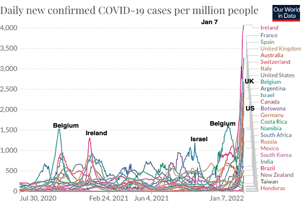
Omicron Spread
 Source: What omicron's fast spread could mean | NPR Dec 10 |
 Source: Worldmeter |
Why Does the Pandemic Seem to Be Hitting Some Countries Harder Than Others? | The New Yorker Feb. 22, 2021
Summary Here.
Other countries -
See also: OurWorldinData
Source: COVID-19 pandemic death rates by country - Wikipedia
892 in the US is about 0.1%
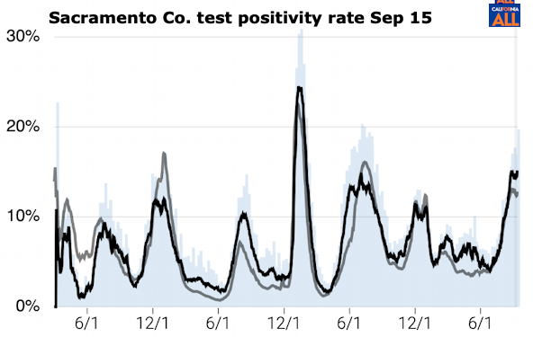
Test Positivity Rate
Experts advise looking at three measurements together: number of cases, case positivity rates and number of deaths to understand what is going on.
Test Positivity Rate is important because a high positivity rate probably means that the case count is low. See Positivity Rate.
WHO guidelines want it to be below 5%. When a positivity rate is higher, epidemiologists start worrying that means only sicker people have access to tests and a city or region is missing mild or asymptomatic cases.
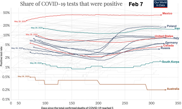
Testing and Positivity | Johns Hopkins
See Positivity Rate for more.
See Epicenters
CDC COVID Data Tracker
COVID was the leading cause of death in the United States in January 2021:
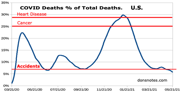
Provisional Death Counts for Coronavirus Disease 2019 (COVID-19) | CDC
The average percent of COVID-19 deaths from Mar. 21, 2020 to May 22, 2021 was 14.4%.
That made it #3 behind heart disease (28%) and cancer (25%) as cause of death.
Note: These are the 2019 rates for heart disease and cancer.
They may be lower in 2020 because people weakened from these diseases may have succumbed to COVID first. I don't know how the CDC counts someone who dies of heart disease because of stress from COVID.
See Cause of Death
See 1918 Flu
Total Deaths per 1 Million Sept 25
|
|
Source: Worldmeter  See Positivity Rate. The epicenters keeps changing: The first confirmed case relating to the COVID-19 pandemic in the United States was announced by the state of Washington on January 21, 2020. Washington made the first announcement of a death from the disease in the U.S. on February 29 Washington had the highest absolute number of confirmed cases (500) and the highest number per capita (7 cases per 100,000)of any state in the country, until it was surpassed by New York state on April 10.
I moved back to California from New Jersey a couple of years ago. In April my friends in New Jersey had 10 times the chance of encountering a person with COVID-19 than I did in California. In July the numbers have flipped with California having 6 times and Florida 12 times the incidence of NJ.
States with rates 50% higher than the national average are in bold.
| |||||||||||||||||||||||||||||||||||||||||||||||||||||||||||||||||||||||||||||||||||||||||||||||||||||||||||||||||||||||||||||||||||||||||||||||||||||||||||||||||||||||||||||||||||||||||||||||||||||||||||||||||||||||||||||||||||||||||||||||||||||||||||||||||||||||||||||||||||||||||||||||||||||||||||||||||||||||||||||||||||||||||||||||||||||||||||||||||||||||||||||||||||||||||||||||||||||||||||||||||||||||||||||||||||||||||||||||||||||||||||||||||||||||||||||||||||||||||||||||||||||||||||||||||||||||||||||||||||||||||||||||||||||||||||||||||||||||||||||||||||||||||||||||||||||||||||||||||||||||||||||||||||||||||||||||||||||||||||||||||||||||||||||||||||||||||||||||||||||||||||||||||||||||||||||||||||||||||||||||||||||||||||||||||||||||||||||||||||||||||||||||||||||||||||||||||||||||||||||||||||||||||||||||||||||||||||||||||||||||||||||||||||||||||||||||||||||||||||||||||||||||||||||||||||||||||||||||||||||||||||||||||||||||||||||||||||||||||||||||||||||||||||||||||||||||||||||||||||||
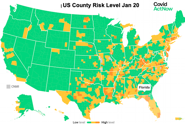
See the See Timeline for a history of infection rates and the tier system October 2020 - June 2021 (Alpha surge).
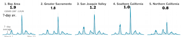
Bay Area Region vs Other Regions
A LA Times report said that in January 2022 the death rate in southern California was 3 times higher than the Bay Area.
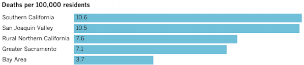
The Bay Area in California has traditionally had the second lowest rate of California's 5 regions behind the Northern California region and was usually lower than the State rate. As of May 2022 the Bay Area cumulative death rate over the life of COVID was about half the other regions. See above.
As of May 2022 it has the highest new case rate rate. It is still lower than historical rates.
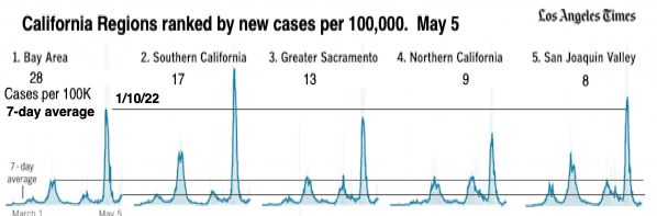
See Current Region data above.
I Had a theory that the regions which had higher rates in the past have developed a herd immunity.
However, as of the end of July Southern California and the San Joaquin Valley were back on top with the highest rates, so that theory doesn't hold.
My new theory is that areas with the highest inter-state and international visitors are affected first. That was the case in the North East states also.
The CDC sampled blood for antibodies from September 2021 to February 2022 and concluded that almost 60% of Americans had been infected, which is much higher than the 24% of cases reported, so we would be approaching heard immunity numbers. However the frequent mutations in the omicron variant messes up the heard immunity theory.
North Central Califronia Counties Map
See county data below.
 COVID-19 | California Department of Public Health
 covid19.ca.gov
![]() California | The COVID Tracking Project
California | The COVID Tracking Project


Average new cases per day per 100,000 .
June 2021 -
| 06/05 2021 | 07/15 | 08/14 | 9/3 | 11/1 | 1/7 | 2/1 | 2/25 | 3/12 | 4/2 | 5/6 | 5/27 | 8/18 | 9/29 | 10/21 | 11/11 | 12/10 | 1/13 2023 | 2/1 | 3/3 | ||
|---|---|---|---|---|---|---|---|---|---|---|---|---|---|---|---|---|---|---|---|---|---|
| United States | 4.2 | 9.3 | 39 | 50 | 20 | 195 | 126 | 22 | 10 | 7 | 21 | 33 | 29 | 14 | 11 | 12 | 20 | 18 | 13 | 10 | United States |
| California | 2.3 | 8.7 | 34 | 35 | 15 | 166 | 148 | 26 | 11 | 6 | 19 | 39 | 29 | 12 | 8 | 10 | 29 | 16 | 9 | 9 | California |
| Bay Area | Bay Area | ||||||||||||||||||||
| San Francisco | 22 | 7 | 167 | 87 | 32 | 8 | 14 | 42 | 59 | 22 | 10 | 8 | 16 | 27 | 14 | 8 | 12 | San Francisco | |||
| San Mateo | 1.3 | 6.4 | 21 | 23 | 8 | 174 | 109 | 23 | 13 | 11 | 37 | 61 | 23 | 10 | 10 | 14 | 28 | 14 | 7 | 9 | San Mateo |
| Santa Clara | 1.3 | 5.1 | 18 | 25 | 8 | 163 | 133 | 22 | 10 | 11 | 33 | 59 | 26 | 10 | 9 | 10 | 33 | 16 | 10 | 10 | Santa Clara |
| Alameda | 119 | 18 | 10 | 9 | 26 | 50 | 19 | 9 | 7 | 10 | 28 | 15 | 7 | 12 | Alameda | ||||||
| Contra-Costa | 25 | 50 | 27 | 9 | 10 | 9 | 28 | 16 | 7 | 15 | Contra-Costa | ||||||||||
| Napa | 1.4 | 5.1 | 25 | 26 | 8 | 149 | 117 | 28 | 19 | 6 | 23 | 37 | 24 | 9 | 10 | 2 | 19 | 14 | 10 | 9 | Napa |
| Marin | 31 | 60 | 18 | 7 | 7 | 2 | 19 | 11 | 8 | 9 | Marin | ||||||||||
| Sanoma | 182 | 139 | 26 | 17 | 8 | 29 | 46 | 19 | 9 | 9 | 6 | 17 | 13 | 6 | 8 | Sanoma | |||||
| Solano | 1.3 | 10 | 27 | 66 | 11 | 120 | 122 | 49 | 13 | 6 | 20 | 50 | 22 | 8 | 7 | 5 | 23 | 16 | 9 | 10 | Solano |
| Greater Sacramento | Greater Sacramento | ||||||||||||||||||||
| Yolo | 1.8 | 6.3 | 33 | 44 | 18 | 159 | 102 | 19 | 11 | 11 | 20 | 43 | 26 | 5 | 9 | 13 | 16 | 9 | 7 | 8 | Yolo |
| Sacramento | 0.3 | 11.7 | 39 | 73 | 14 | 117 | 121 | 25 | 10 | 7 | 15 | 38 | 24 | 9 | 10 | 10 | 21 | 11 | 9 | 10 | Sacramento |
| Placer | 1.3 | 8.3 | 37 | 77 | 24 | 91 | 109 | 24 | 8 | 4 | 12 | 34 | 19 | 7 | 7 | 8 | 19 | 11 | 7 | 8 | Placer |
| Sutter | 13.4 | 60 | 72 | 22 | 99 | 110 | 26 | 22 | 8 | 11 | 29 | 30 | 11 | 6 | 6 | 16 | 16 | 5 | 6 | Sutter | |
| El Dorado | 11 | 30 | 16 | 6 | 5 | 10 | 19 | 10 | 5 | 5 | El Dorado | ||||||||||
| Sierra | 0 | 16 | 3 | 0 | 5 | 14 | 10 | 0 | 5 | 13 | 0 | 5 | 0 | 0 | Sierra | ||||||
| Davis | 18 | 4 | 212† | 41 | 10 | 6 | 4 |
Bay Area & Sac Area (partial) County Case Rates:
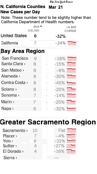
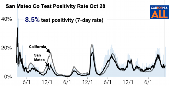
Why are the cases per 100K different in the NY Times report and the California State report? (Yolo and San Mateo below)
Both numbers are probably low because of many cases not being reported.
Cumulative to Sept 24, 2022
I don't know why the Times shows higher numbers per 100K than the state data below (only San Mateo and Yolo are shown but numbers are higher for all counties).
I sent the Times a question, but haven't heard back.
See Davis Wastewater Testing below.
| Deaths per 100,000 | Cases per 100,000 | Vaccinated | |
|---|---|---|---|
| United States | 317 | 28,875 | 68% |
| California | 243 | 28,423 | 74% |
| Bay area | |||
| Santa Clara › | 129 | 23,242 | 88% |
| Contra Costa › | 123 | 23,277 | 83% |
| Alameda › | 121 | 21,838 | 84% |
| Marin › | 120 | 19,360 | 91% |
| San Francisco › | 117 | 21,428 | 86% |
| Napa › | 116 | 24,330 | 80% |
| San Mateo › | 108 | 23,177 | 86% |
| Sonoma › | 105 | 22,578 | 80% |
| Solano › | 103 | 25,040 | 70% |
| Greater Sacramento | |||
| Sutter › | 242 | 27,498 | 62% |
| Sacramento › | 222 | 24,371 | 69% |
| Placer › | 166 | 21,275 | 69% |
| Sierra › | 166 | 12,080 | — |
| Yolo › | 152 | 23,362 | 72% |
| El Dorado › | 120 | 18,875 | 64% |
San Mateo County
San Mateo County coronavirus cases: Tracking the outbreak - Los Angeles Times
San Mateo County Health
Average cases per day and per 100,000 30 days as of Aug 18
| City | Pop- ulation | Av. Cases per day | Current 7-day |
|
|---|---|---|---|---|
| Total | per 100K |
|||
| US | 331M | 19 | 29 | |
| California | 39.5M | 16 | 29 | |
| San Mateo Co | 743,331 | 45 | 14 | |
| Colma | 1,302 | 2.2 | 166 | |
| East Palo Alto | 29,593 | 22.3 | 75 | |
| North Fair Oaks | 14,374 | 8.8 | 61 | |
| South San Francisco | 67,402 | 36.6 | 54 | |
| Daly City | 106,668 | 56.2 | 53 | |
| San Bruno | 43,086 | 20.6 | 48 | |
| Redwood City | 85,784 | 40.1 | 47 | |
| Broadmore | 5,171 | 2.4 | 46 | |
| Brisbane | 4,696 | 2.1 | 45 | |
| Woodside | 5,544 | 2.4 | 44 | |
| Millbrae | 22,631 | 9.8 | 43 | |
| Burlingame | 30,573 | 12.6 | 41 | |
| Pacifica | 38,975 | 16.0 | 41 | |
| San Carlos | 30,159 | 12.2 | 41 | |
| San Mateo | 104,343 | 41.7 | 40 | |
| Belmont | 27,103 | 10.4 | 38 | |
| Menlo Park | 34,137 | 12.7 | 37 | |
| Foster City | 33,987 | 11.3 | 33 | |
| Ladera | 1,607 | 0.5 | 31 | |
| Half Moon Bay | 12,833 | 3.7 | 29 | |
| Portola Valley | 4,594 | 1.3 | 28 | |
| Atherton | 7,166 | 2.0 | 28 | |
| Hillsborough | 11,451 | 3.1 | 27 | |
| Emerald Hills | 4,722 | 1.2 | 25 | |
| West Menlo Park | 4,161 | 1.0 | 23 | |
| Midcoast Region | 11,271 | 2.3 | 20 | |
Sources: [7-day average case count]
* LA Times may report total for 7-days not the per-day-average.
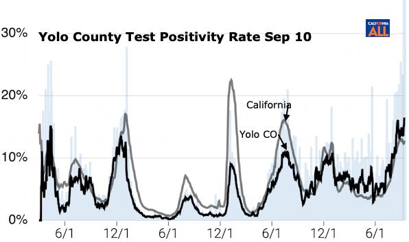
Yolo Co. Covid-data-tracker| CDC
Yolo County no longer lists Davis Stats.
City Wastewater Data
Healthy Davis Together Historic Wastewater Testing
In January, Yolo County had 248 new cases per 100,000 reported and Davis had 212. Davis rates have traditionally been lower than Yolo County.
On Nov 7th Yolo County had 8 new cases reported per 100,000, 3% of the peak, but Davis wastewater counts were 23% of the peak.
So about 13% of cases are being reported.
The general explination for this is:
1. More asymptomatic cases which are not reported.
2. People doing self testing with mild symptoms which are not reported.
This along with an April, 2022 CDC report indicated that almost 60% of the U.S. population has been infected. means that as of June only about 10% of infections were being counted.
Although wastewater indicates a high level of infection at the end of August, Yolo county hospitalizations are 20% of what they were in January. California hospitalizations were 25% of January's.
Bay Area Wastewater
Sewer Coronavirus Alert Network (SCAN) tracking - Stanford
California, San Francisco Co, Santa Clara, Santa Clara Co, San Mateo, Alameda Co, Alameda, Sierra, Yolo, Yolo Co, Napa, Sonoma, Solano, Sacramento, Placer, Sutter, Sutter Co, Solano County Public Health Dashboards, Coronavirus Report for Napa County, CA - LiveStories, Coronavirus (COVID-19) | Napa County, CA, Sacramento, Placer, Sarasota County, Florida | USAFacts, Washoe Co. NV
Other Links:
Coronavirus tracker | Mercury News
Old News
But it turns out only 18% - 80% of actual deaths are counted.
See U. Washington study.
I eventually found web sites that were reporting most of data I was interested in, shown here, you can click on charts to get current versions.
We are concentrating on trends now from the world down to some towns in California. Where are the outbreaks, relative size of the them, history of safety plans etc..
Also listing death rates, hospitilazions and positivity rate where possible.
See more at rational.
Joshua SA. Weitz at Georgie Tech developed a tool to assess the risk that one (or more) individuals in a group was infected.
See Risk Assessment
We are concentrating on trends now from the world down to some towns in California. Where are the outbreaks, relative size of the them, history of safety plans etc..
Also listing death rates, hospitilazions and positivity rate where possible.
See more at rational.
There are other measurements that would be helpful in understanding the progress of the epidemic in different places, such as the number of new hospitalizations, the number of tests administered or the number of people showing any symptoms of respiratory illness. But confirmed coronavirus cases and deaths, however incomplete, are the most useful daily statistics currently available at a local level everywhere in the country.
Hospitalizations and deaths lag cases by one to two weeks.
 Coronavirus Disease 2019 (COVID-19) | CDC - Updated frequently
 Johns Hopkins Coronavirus Resource Center
- Updated frequently
Johns Hopkins Coronavirus Resource Center
- Updated frequently
 Coronavirus Update (Live) - Worldometer
 Our World in Data
 COVID-19 statistics and analysis | Nucleus Wealth
 How is the Economy Doing? | USA Facts


 Coronavirus chart: has your country's epidemic peaked? | Financial Times
 COVID-19 Projections
 "
"