 Technology
Character Sets
Typography
Technology
Character Sets
Typography
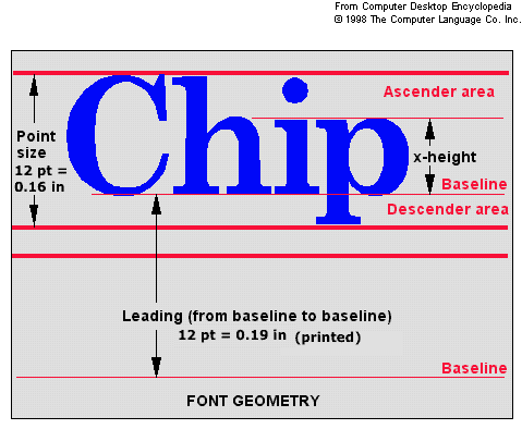
There are 72 points in an inch
Type Size Is Measured From Top Of Ascender To Bottom Of Descender In Points
  (Some refer to it as baseline to baseline the same as leading)
Capital Letters Are Usually Approximately 70% Of The Point Size
12pt 18pt 24pt 36pt
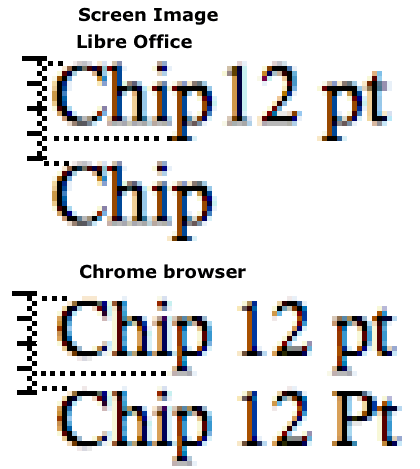
Chip 12 pt
Video monitors:
A a 12 point font uses 16 pixels. Libre office had 4 pixels between lines for 20 pixel leading; the chrome browser had 2 pixels between lines for 18 pixel leading.
A formula for readable line length (or column width) is:
40% of the body copy point size in inches

In CSS a pixel is 1/96 of an inch.
Actual monitors vary See Video Resolution
See also:
Font Size Intervals at CleverChimp.com
Fonts:
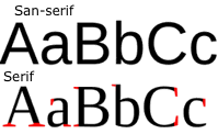 A serif font has small projecting features called "serifs" at the end of strokes.
At fonts.com they say,
Serif typefaces have historically been credited with increasing both the readability and reading speed of long passages of text because they help the eye travel across a line.
WritingSpaces.org says,
"Many people feel that sans serif fonts look “cleaner” and more “modern,” while serif fonts look more traditional, more book-like. The conventional wisdom has been that serif fonts are more readable—particularly in print—while sans serif fonts are more legible.
If you have to read large blocks of text, the serifs at the ends of letters makes them easier to identify and easier to read. On the other hand, the simplicity of Sans Serif fonts are thought to make these fonts more legible and easier to read in small sizes or on coarse screens. For these reason, you see lots and lots of sans serif fonts on web pages.
We are not convinced that the serif vs. sans serif argument really matters anymore."
The NY Times changed their font from Times New Roman to Georgia (both serif fonts), which is a little wider and which many people find easier to read. We continue to use Arial as our sans serif font.
Alex Poole says,
"In 2003 as part of my master’s degree I reviewed over 50 empirical studies in typography and found a definitive answer.
Do serifs contribute to the legibility of typefaces, and by definition, are sans serif typefaces less legible? To date, no one has managed to provide a conclusive answer to this issue.
Legibility is concerned with the very fine details of typeface design, and in an operational context this usually means the ability to recognise individual letters or words. Readability however concerns the optimum arrangement and layout of whole bodies of text:"
Douglas Bonneville says at Smashing Magazine,
"By far the most popular principle for creating typeface combinations is to pair a sans serif header typeface with a serif body typeface."
However, I've seen brochures with the opposite. San-serif headers with Serif text.
fonts.com says,
Serifs can impede the readability of characters at very small sizes."
Web Pages:
Michael Martin's article at Smashing Magazine says,
According to our study, sans-serif fonts are still more popular than serif fonts for headlines, although they seem to have dropped in popularity in recent years.
Two thirds of the websites we surveyed used sans-serif fonts for body copy.
- The most popular serif typefaces for headlines are Georgia (28%) and Baskerville (4%).
- The most popular serif typefaces for body copy are Georgia (32%) and Times New Roman (4%).
- The most popular sans-serif typefaces for headlines are Arial (28%), Helvetica (20%) and Verdana (8%).
- The most popular sans-serif typefaces for body copy are Arial (28%), Verdana (20%) and Lucida Grande (10%).
Most books and newspapers use serif fonts
Brochures use both although san-serif seems to be more common.
Most web sites use san-serif fonts.
Most plaques use serif fonts.
A scientific study (funded by Microsoft, so take with a grain of salt) touted Verdana's readability, particularly at small sizes. It was one of the first fonts that was designed with readability on the screen particularly in mind, so it has a large x-height (good for seeing the lowercase letters) and is well-hinted. These advantages will become less relevant as pixel density increases, but they're good things to look for in a screen font for now.
Terms:
Typeface - e.g. New Times Roman, Helvetica, Courier, ...
Font - Size (points) and style (Bold, Italic, ...) Font Family - Same a typeface. The arial family includes "arial bold", "arial italic", .. Generic Families - A class as in CSS serif, sans-serif, monospace. Glyph - An elemental symbol as part of a character. A diacritic (e.g. cedilla in ç ) is a glyph. Leading - The distance from one baseline to the next Pre computer leading was the distance between the descender and ascender of the next line. OpenType Font - Newer - Adobe and Micorosof TrueType Font - Most common - Apple 1980's for Mac and Win Pica - 12 points Legibility is concerned with the very fine details of typeface design, and in an operational context this usually means the ability to recognise individual letters or words. Readability however concerns the optimum arrangement and layout of whole bodies of text:" em - A unit equal to the currently specified point size
Links:
Fonts - Typeface:
Choosing a Font: Serif vs. Sans Serif | Writing Spaces
Which Are More Legible: Serif or Sans Serif Typefaces? | Alex Poole
Typographic Design Patterns and Best Practices | Smashing Magazine
typeface: Definition from Answers.com
Best Practices of Combining Typefaces | Smashing Magazine
Other:
typography - Optimum line height in relation to font size - Graphic Design Stack Exchange
Point (typography) - Wikipedia
Plaques and Signs
CSS Font-Size: em vs. px vs. pt vs. percent / Kyle Schaeffer